How Nonprofits Engage Mobile Users
11 Mar 2013, 4 min read.
A few weeks ago, Atlanta Ballet asked me to be part of a conversation with a reporter from Philanthropy.org who was writing an article about mobile websites. I’ve been working with Atlanta Ballet for several years, wearing many different hats from paid search account manager, to SEO analyst, and have had the privilege of project managing the complete redesign of their website which launched in the spring of 2012.
At the time we started the website concept and initial wireframes, responsive design was still in its infancy. Neither Google nor Bing had come out in support of this approach, and one of the only major websites using media queries was The Boston Globe which was designed by Ethan Marcotte, the “father” of responsive design. We worked tirelessly with the Atlanta Ballet to think through all aspects of user experience and launched a design not only resizes to a variety of screen widths, but adapts to help mobile users easily navigate and digest content.
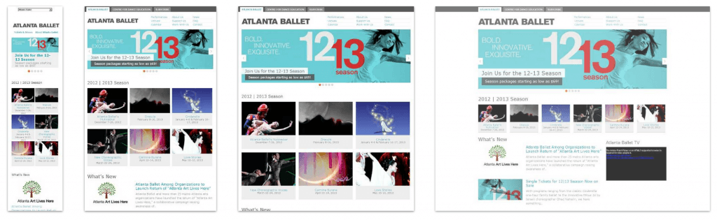
When we started along this project, we knew the percentage of mobile users visiting the site was going to rise. Mobile visits grew from under 10% a couple years ago to about a third of site visits in 2013. After launch, we found that mobile users were viewing more pages, staying on the site longer, and, most importantly, buying more tickets than ever before. We have continued to refine the design post-launch by adding a more intuitive top navigation, featuring recent performances on the homepage, optimizing for retina displays and a variety of other factory to further engage users on a variety of devices.
The article, Charities Take Different Paths to Attracting Mobile Viewers, was recently published on Philanthropy.org and discusses a variety of approaches for engaging mobile users. My recommendation is to give responsive design a try, but every business is different, so be sure to explore all your options.
Charities Take Different Paths to Attracting Mobile Viewers
By Nicole Wallace
Breastcancer.org got lots more attention from supporters once it made its Web site easy to read and maneuver on a smartphone.
Before the redesign, 94 percent of people who visited the site on a smartphone left after seeing just one page. Now only 5 percent do.
“That was a big win,” says Michele McLaughlin Zwiebel, the charity’s director of programs and content.
The breast-cancer group used a combination of approaches to make its site easy to navigate. It created a separate mobile site, designed specifically for smartphones and small tablets, which provides information about breast cancer and treatment options.
But for the site’s active discussion boards, the organization adopted a practice called responsive design, which allows a single Web site to display material in different ways based on the size of the viewer’s screen.
For example, a site might appear as a single column or hide some content when viewed on a smartphone but have a two- or three-column layout when viewed on a desktop computer or a large tablet.
Like the breast-cancer group, more charities want to make their Web sites mobile-friendly, but they are divided on the best approach.
More Devices
A growing number of nonprofits are choosing responsive design, despite its greater complexity and almost always higher price tag.
The proliferation of mobile devices is driving the increased interest. Even two years ago, it was still a “two-device world”-smartphones and desktops, says Jordan Silton, a technology consultant at Search Discovery who works with the Atlanta Ballet.
But since then the landscape has changed, with the introduction of tablets in several sizes and mobile phones with larger screens. “What the responsive-design layout has allowed us to do is create a Web site that accommodates not only big desktop computers and small mobile phones but everything in between,” he says.
Responsive design was appealing to Mercy Housing, in Denver, because with a limited number of employees focused on technology, it would have been difficult to maintain and update two sites, says Gail Bransteitter, who oversees communications.
Simple Is Best
But not everyone is convinced that responsive design is the way to go.
“A lot of times people are betting big on responsive design because it sounds like a magical pill that will solve everyone’s problems,” says John Overy, director of mobile technology at World Vision. “But it’s harder to implement than a lot of people believe.”
World Vision has a mobile Web site that features material the group thinks visitors are most likely to want. People use tablets and smartphones very differently, so it doesn’t make sense to provide the same information on both devices, says Mr. Overy.
He says someone on a tablet is likely to be relaxing on the couch at night, checking e-mail and exploring the Web, while a person using a mobile phone tends to be more task-oriented and on the go.
“You’re probably waiting for your child while they’re at soccer practice or you’re in line,” says Mr. Overy. “It tends to be much more snackable.”
The American Cancer Society also has a separate mobile site. David Balcom, managing director of digital platforms, worries that responsive design loads more slowly because the file has to include the coding for three screen sizes.
Mr. Balcom says he designs for the mobile user first, something he thinks benefits everyone who comes to the organization’s site.
“It trains us to be simple: What’s the most amount of information we can fit into a small screen?” he says. “Oftentimes that promotes conversations of simplicity and of elegance. And I think that is a great way to start, rather than start with a giant screen and then have to throw things out for mobile.”
To get in touch, connect on LinkedIn, send a message on X, or write to jordan@jordansilton.com.