New Google Top Navigation
19 Dec 2010, 1 min read.
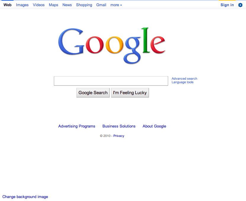
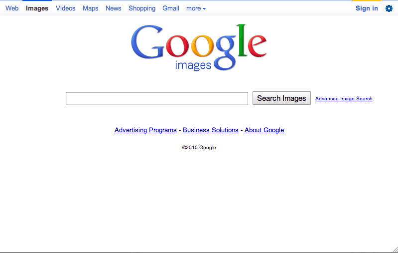
Last month, Google started testing what TechCrunch called a “sexier top nav bar”. It looks like google is rolling out this new top nav bar for the homepage and image search. This bar has a light gray background and a slightly darker line at the top. When a user hovers over the other services (Images, Video, Maps, etc.) a darker blue background is displayed behind the selection.

The top right navigation has also been updated. The “Sign In” button is specifically called out with a yellow top bar. This could be an effort to encourage users to sign in. The “search settings” drop-down has been replaced with the graphic of a gear, implying settings. iGoogle is now featured under this drop-down, further encouraging a personalized dashboard and requesting users to sign-in.

Image search received a similar navigation update, but right now this interface is not available for the other search features.
Since Google appears to be calling out the “Sign In” button, I would expect to see a bigger effort to encourage users to login across Google properties. What data is Google looking for?
Update 02/17/2011: When I originally published the article on Dec. 19, the top nav was still in testing. As of yesterday, a lot more users were seeing the top navigation in testing and this morning, Feb. 17, it launched for all users across multiple Google services. The top navigation now works in Gmail in addition to Google search.
To get in touch, connect on LinkedIn, send a message on X, or write to jordan@jordansilton.com.
