Google’s Black Top Navigation
26 Jun 2011, 1 min read.
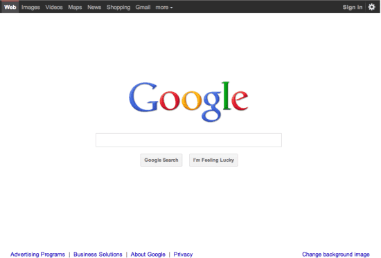
Back in December 2010, I wrote an article about the fancy new top navigation Google was testing. Over time, Google must have seen favorable results of their testing, since that same navigation launched across several Google properties including search, news, images, maps, shopping, Gmail, and more. This evening I opened up my browser and found myself in a new test. The top navigation has turned black and, instead of a blue bar on top of the current selection, has a red bar.
Testing is a great thing, and I applaud every organization that commits to regular testing. It is always good to test your assumptions and even try out variants that are dramatically different than anything you would have originally planned. In many cases, those drastic changes lead to some excellent findings and even more new ideas.
In this case, has Google gone too far? The black and red motif seems like something for the Chicago Bulls website, not Google’s rainbow of blue, red, yellow and green. In every material I have looked at from Google, I have seen their famous four color theme, but never have I seen black as a prominent color. Google does test a lot, and most of their tests never come to fruition. I doubt this one makes it out of testing.
To get in touch, connect on LinkedIn, send a message on X, or write to jordan@jordansilton.com.